For the cover, I drew inspiration from art movements that were popular at the same time as the initial publication and release of this book: Art Nouveau and Art Deco. As we get further down the front cover and "deeper into the story," we experience the unraveling of our humanistic tendencies.
For the Titles and Chapter Headers, I wanted to use a font that portrayed the spooky and mysterious mood of Dr. Moreau’s Island. I also wanted to capture the feeling of a hand-rendered notebook via Edward Prendick. With this in mind, I found Attic Antique. This font was actually hand rendered and photocopied onto the computer. Its rough edges allow for just enough eeriness to leave the audience simultaneously unsettled and intrigued.
In my headers and titles, I made the choice to leave everything lowercase to further add to the feeling of a mysterious journal. This decision makes the audience feel as if the note-taker was rushed by a looming presence.
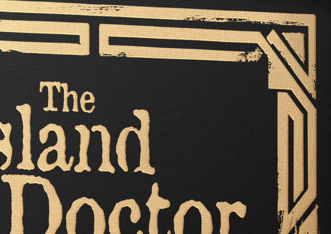

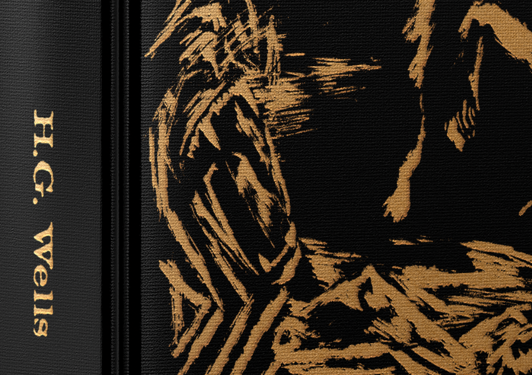
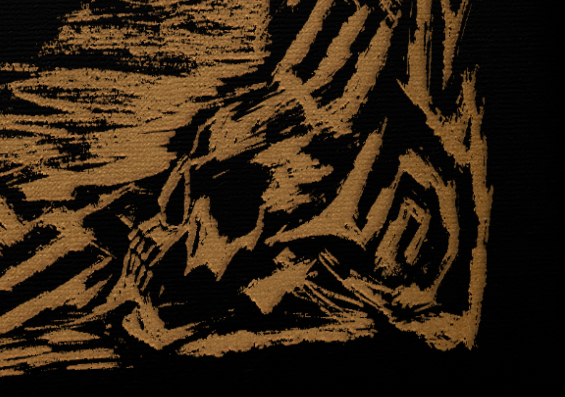
Here we have a closer look at the illustrative decisions. We can see that the decorative border starts out strong and intentional. As we learn more about the island, we uncover more of the secrets hidden by the Doctor. The border is deteriorating parallel to the sanity of the protagonist. We also see one of Moreau's 'patients' going through the transition into a man-animal hybrid.
